ORBIT
ORBIT is a conceptual magazine focused on astronomy, exploring technological innovations, space exploration, and new discoveries about the universe. The design aims to visually reflect the mystery and advancement of space through futuristic typography, cosmic imagery, and clean editorial layouts.
Research
For the wordmark, I researched futuristic and sci-fi inspired typefaces to understand how typography can communicate themes of technology and space exploration. I looked at design references from science fiction media and space-related branding to guide the visual direction.
For the content, I combined and edited various texts to help summarize and synthesize information from astronomy articles in order to create placeholder text for a fictional magazine feature. This allowed me to focus on designing realistic layouts while maintaining relevant subject matter.
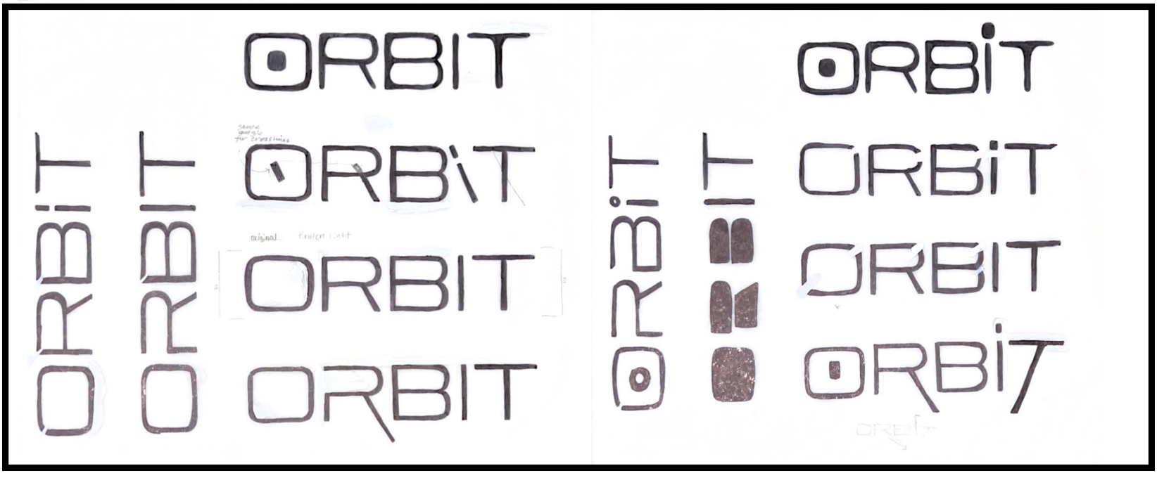
Sketching
I began the design process by sketching different ideas for the ORBIT wordmark and potential layout structures. These sketches explored letter spacing, geometric forms, and ways the typography could reflect movement or planetary orbits. I also experimented with possible grid structures for the magazine spreads to determine how images, headlines, and body text could work together visually.
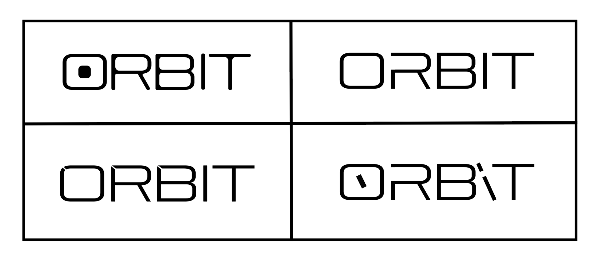
Digital Iterations
After selecting the strongest sketches, I translated the concepts into digital designs. During this stage, I experimented with different typographic styles, spacing, and visual effects to refine the wordmark. Multiple iterations allowed me to test how the logo would appear in different sizes and placements within the magazine layout.
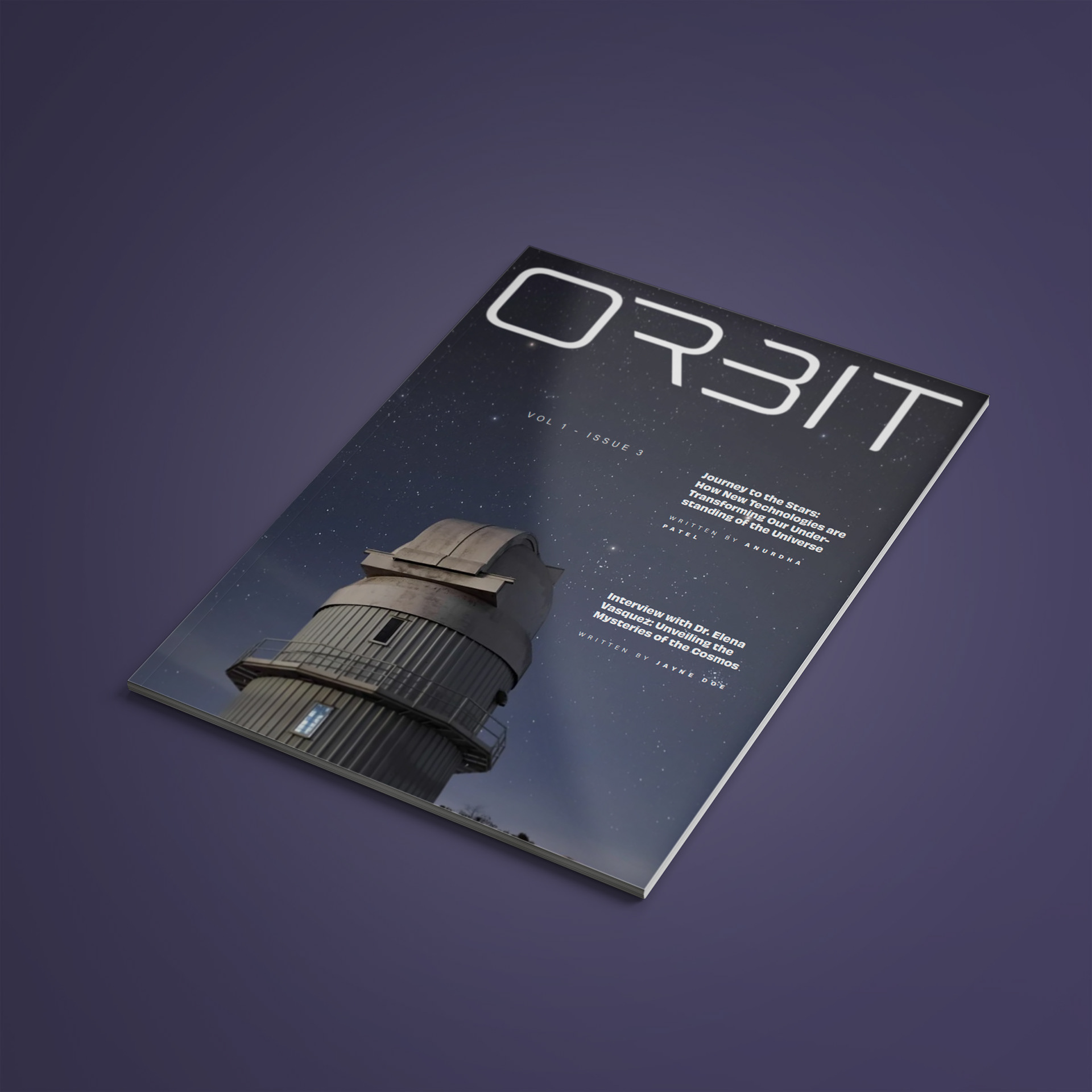
Final Wordmark
The final wordmark balances a futuristic aesthetic with clear readability. The typography reflects themes of technology and exploration while remaining versatile enough to function as a recognizable magazine title across covers and interior spreads.
Spread Iterations
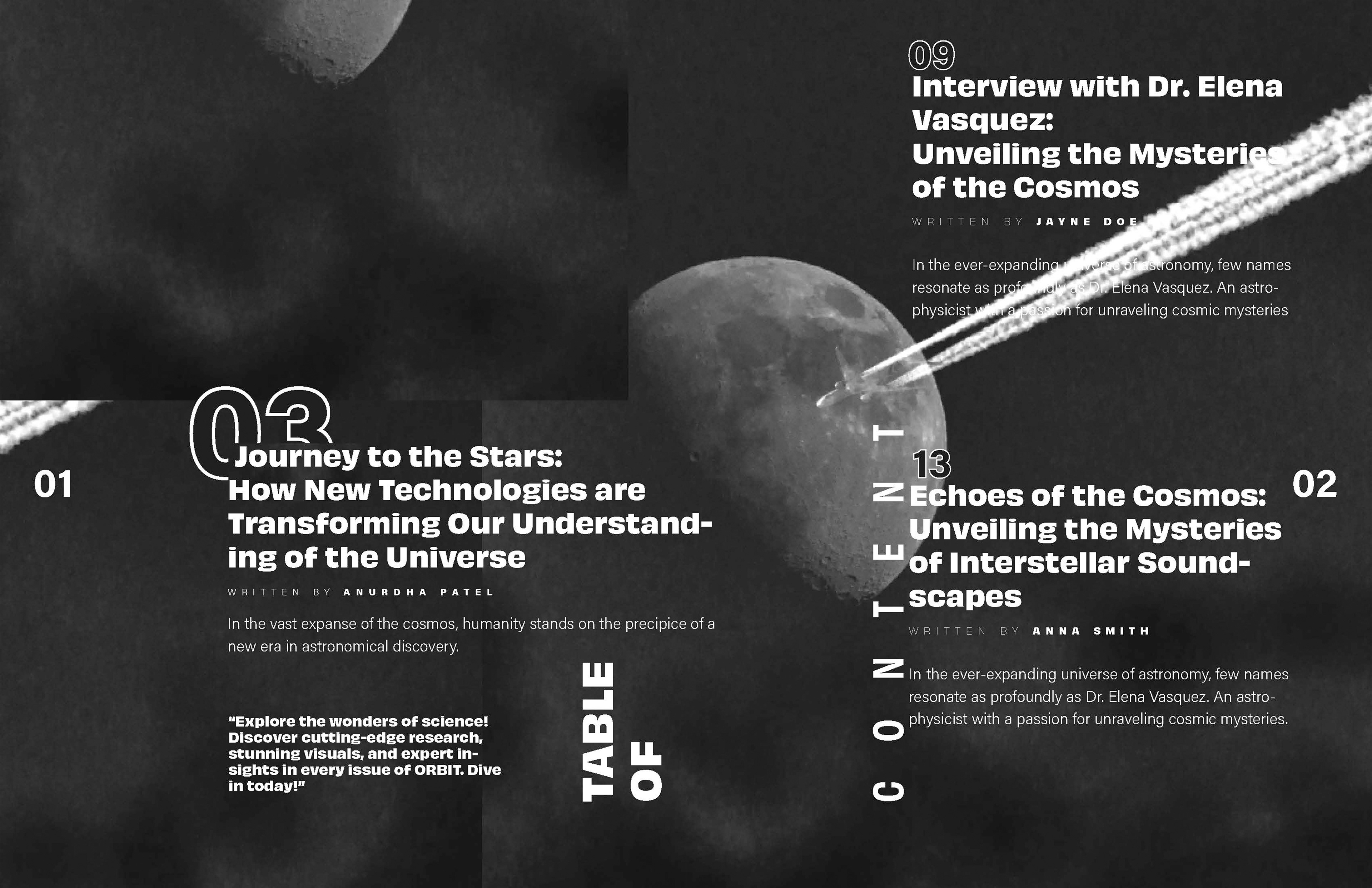
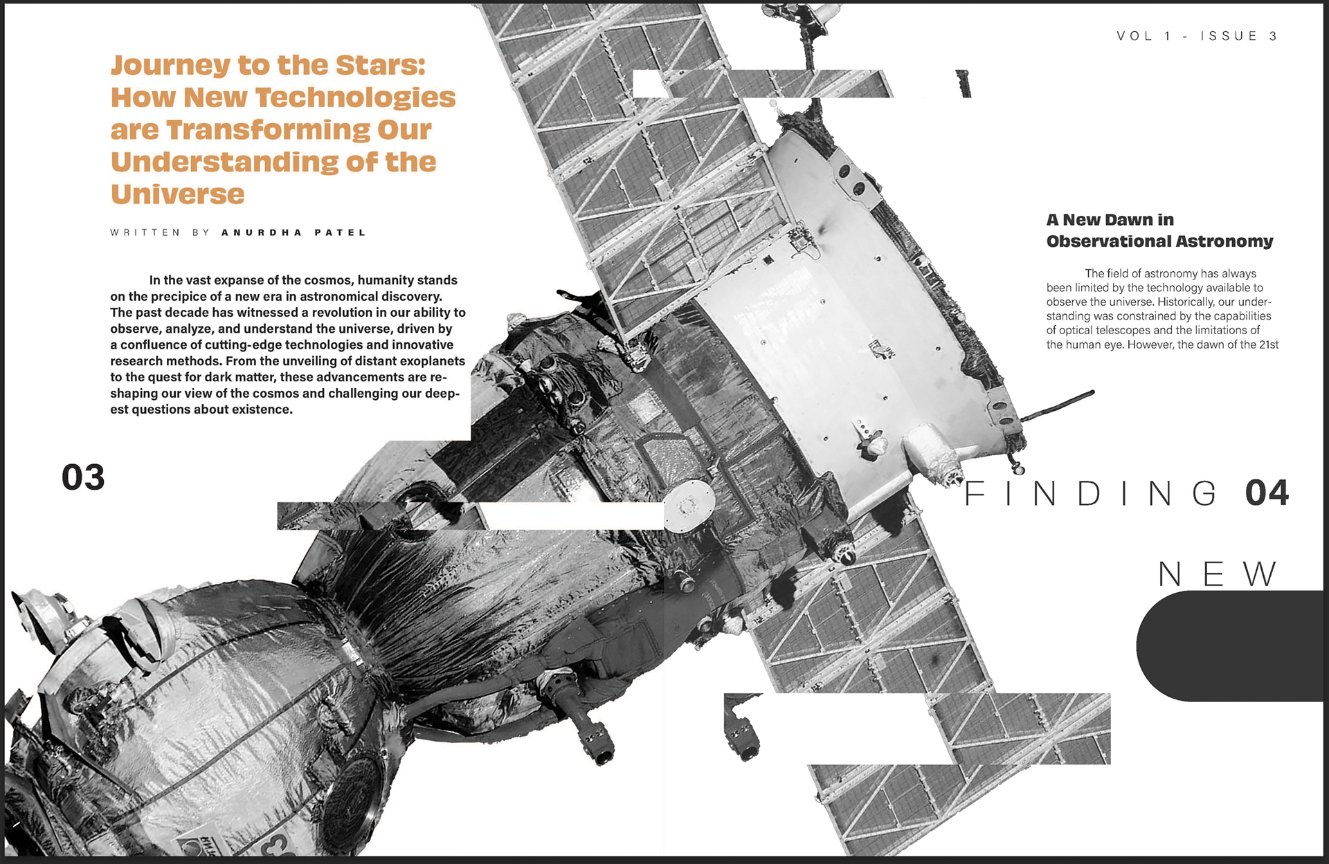
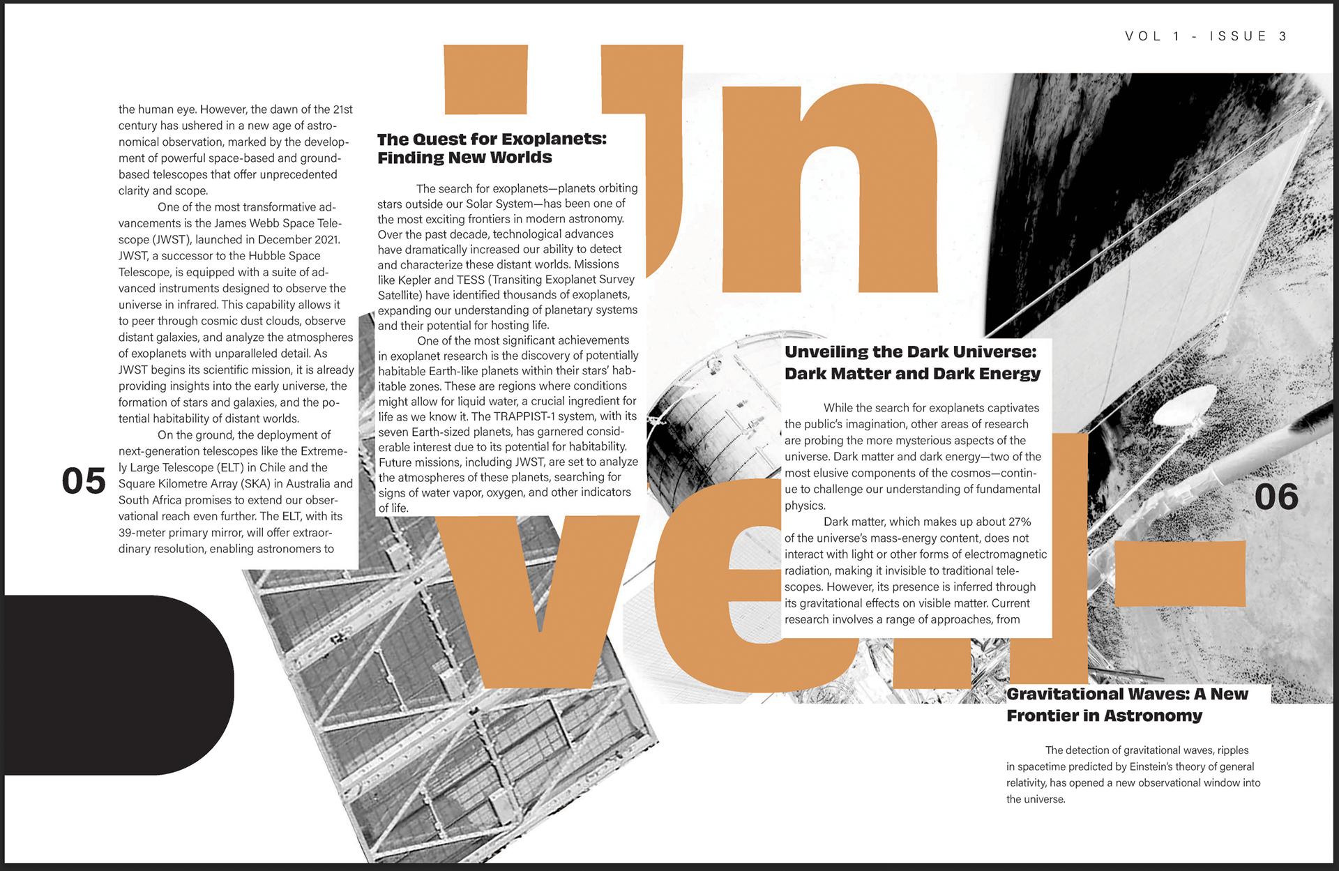
With the wordmark established, I developed several spread layouts for the magazine’s interior pages. These iterations explored different grid systems, image placements, and typographic hierarchies. I experimented with ways to balance large astronomical imagery with readable body text to create engaging and visually dynamic pages.
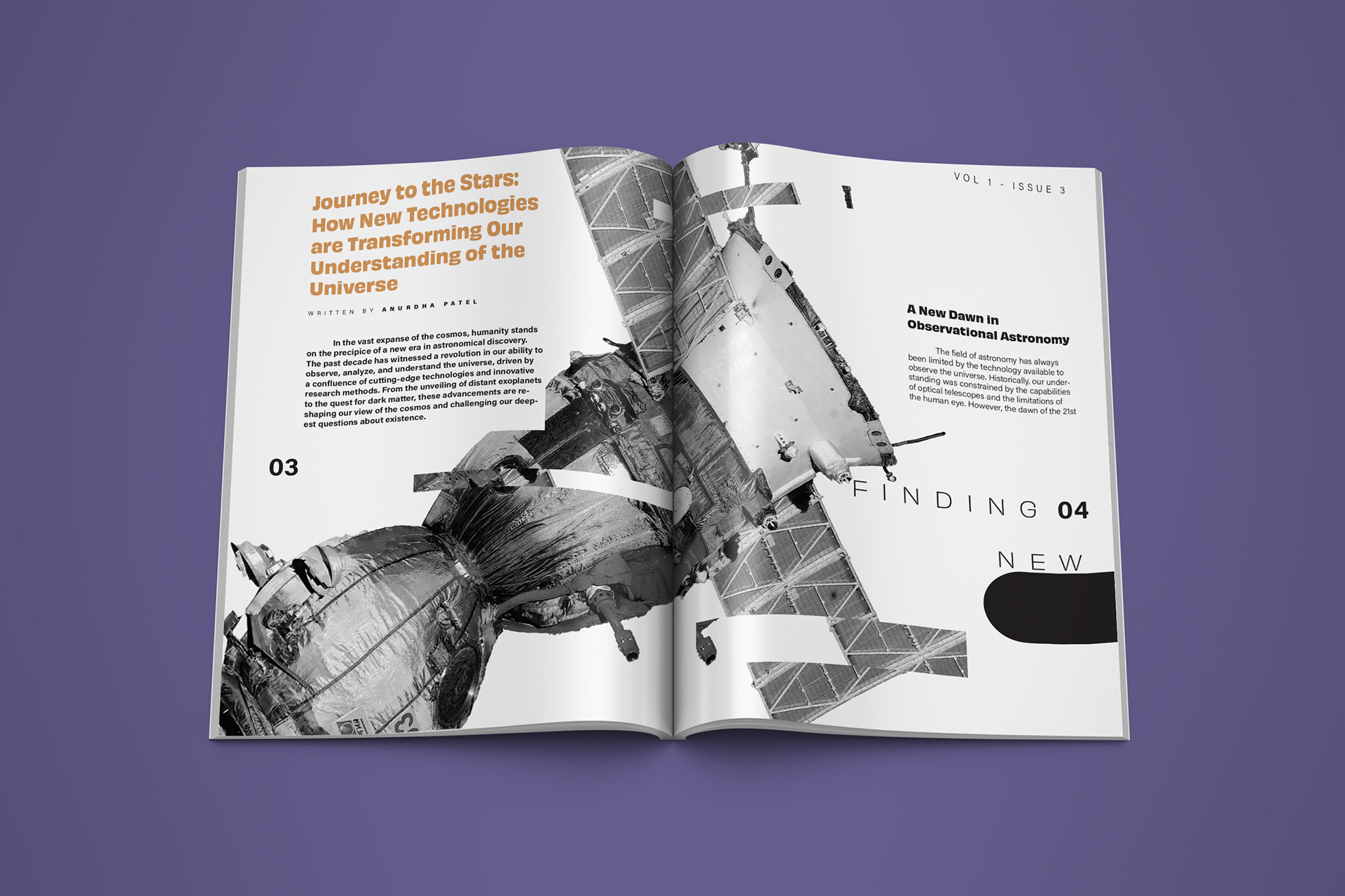
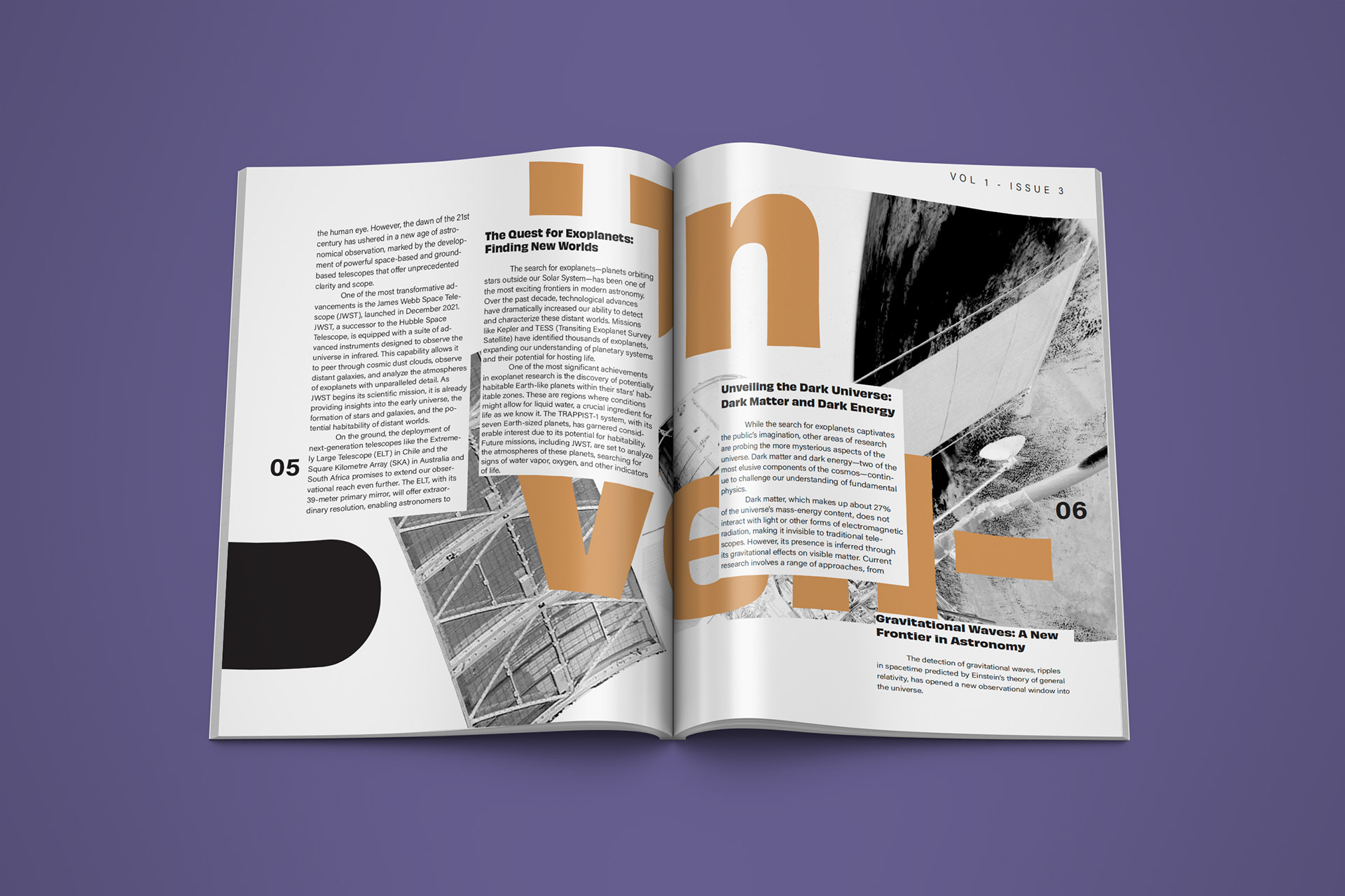
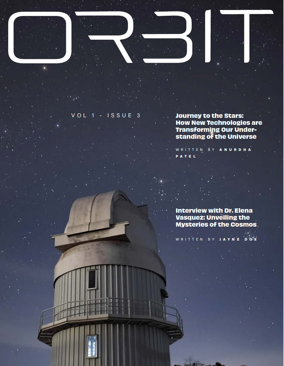
Final Spreads
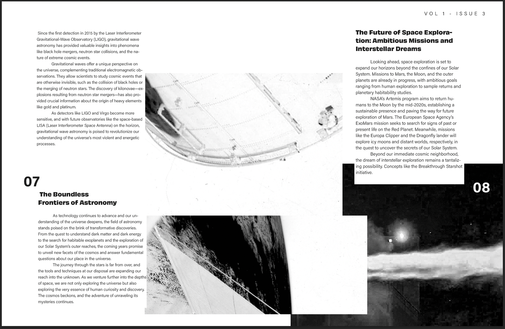
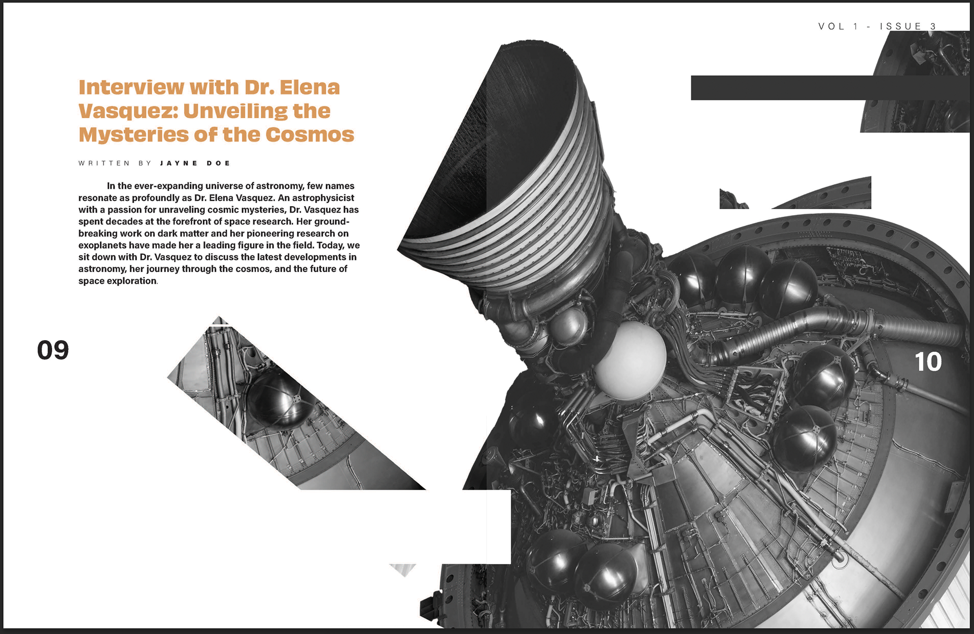
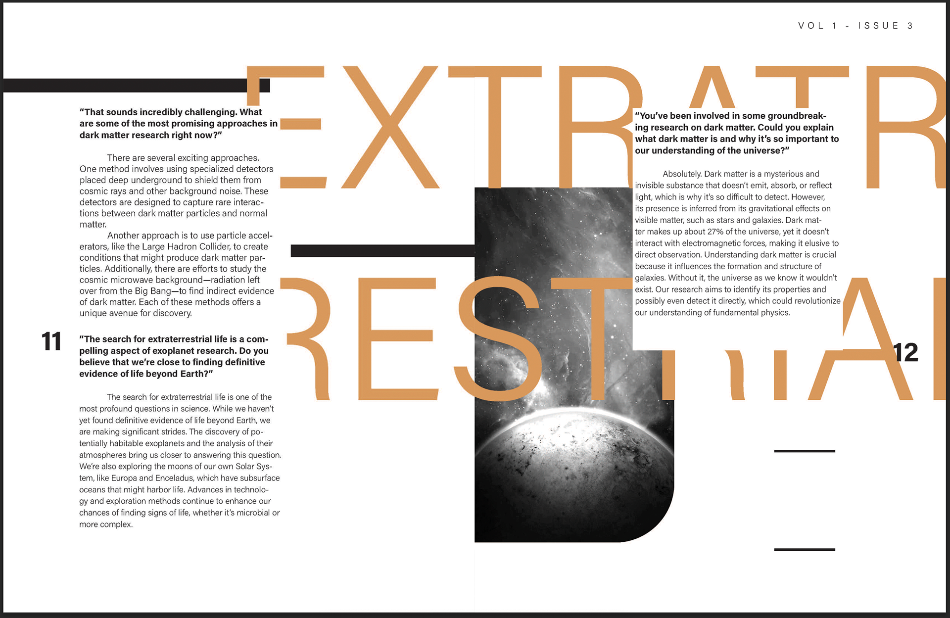
The final spreads present a cohesive editorial design that combines strong typography, structured layouts, and striking space imagery. The design emphasizes clarity and visual flow while maintaining the futuristic theme established in the wordmark.
Final Magazine